

Cono new packaging
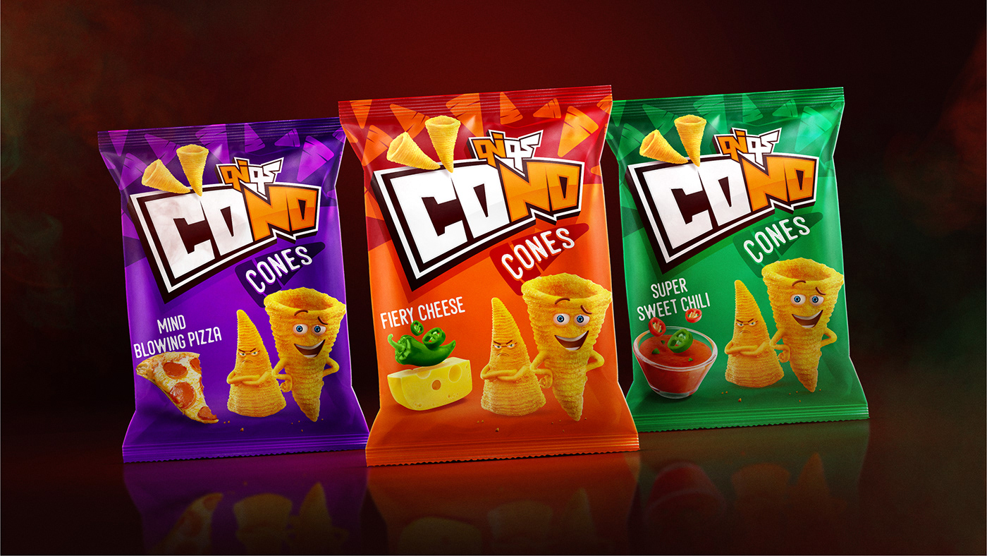
Cono is a corn based snack that used to exist in the market and then disappeared. Now the product is back and we have also 2 new variants established along with the already exist Cono Cones. Our objective was to create a brand revamp that disrupts the market and communicate the newly enhanced and developed Cono products.
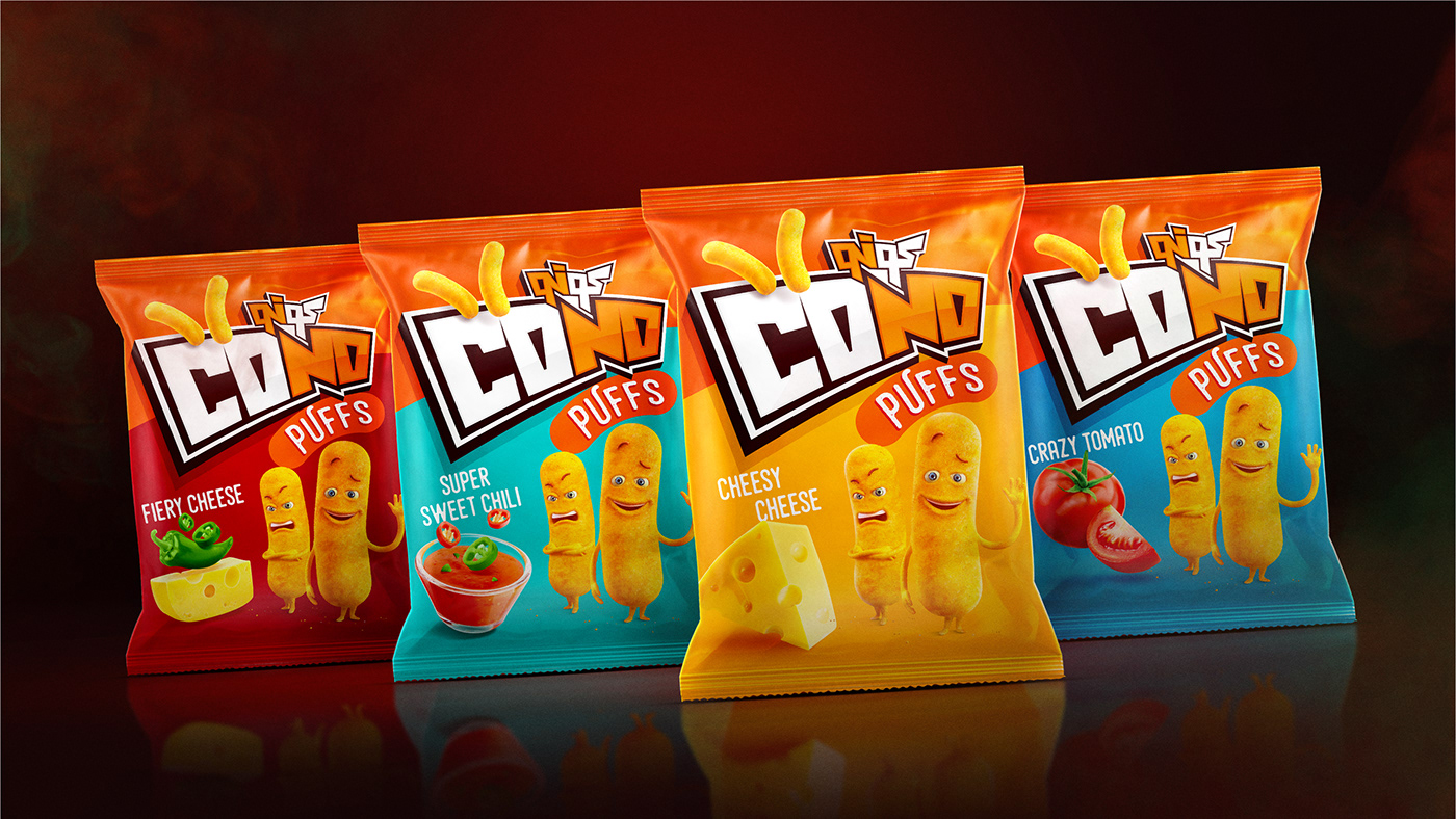
What's great about the logo and packaging uplift is that they fit the the new target audience that is older in age. Also, now we have 2 new products added to the Cones, which are the Puffs and Popcorn and there was a big challenge differentiating the three products under the same family. This was achieved by having the same look and feel but with different patterns, icons, colors and of course, characters.
What's great about the logo and packaging uplift is that they fit the the new target audience that is older in age. Also, now we have 2 new products added to the Cones, which are the Puffs and Popcorn and there was a big challenge differentiating the three products under the same family. This was achieved by having the same look and feel but with different patterns, icons, colors and of course, characters.

logo revamp
The ECCENTRIC
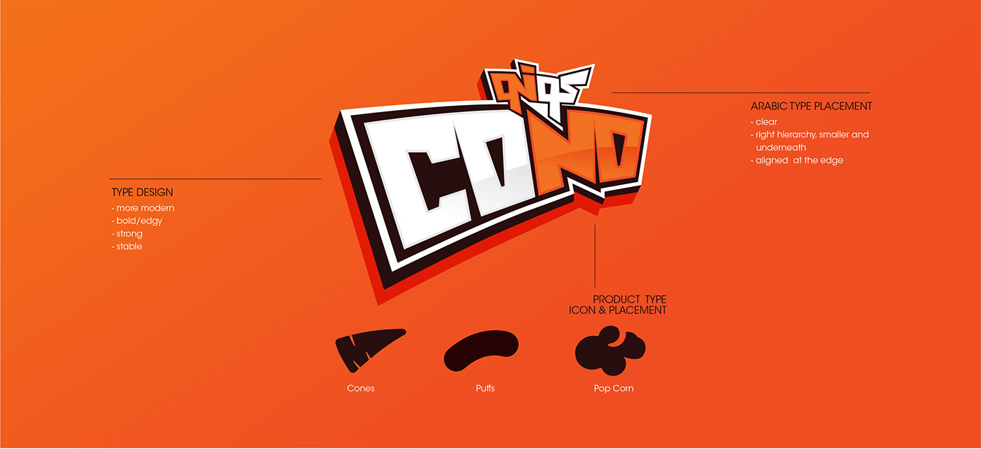
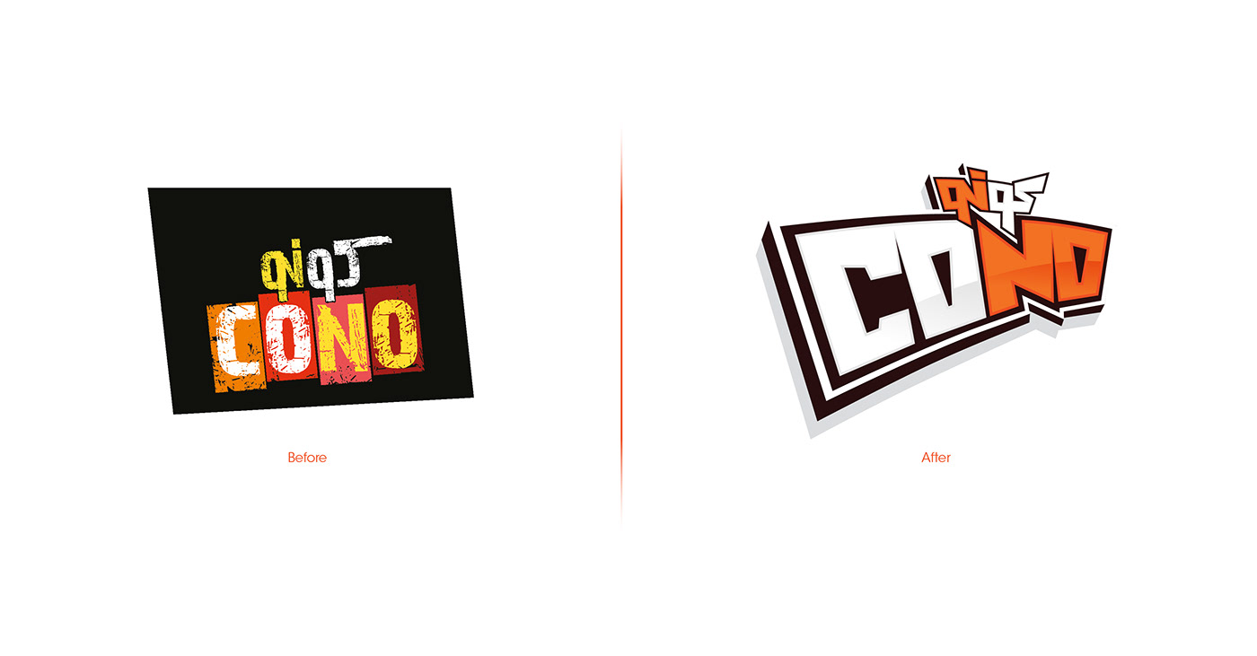
This is a more modern look for the logo , we have given it an edgy look and feel with bold attitude that would work as a great differentiator and also showcase the real colors of how we want people to perceive the brand. Attempting to reach a more minimalistic look and feel and to avoid the clash of colors while still maintaining an eye catchy design.
This is a more modern look for the logo , we have given it an edgy look and feel with bold attitude that would work as a great differentiator and also showcase the real colors of how we want people to perceive the brand. Attempting to reach a more minimalistic look and feel and to avoid the clash of colors while still maintaining an eye catchy design.


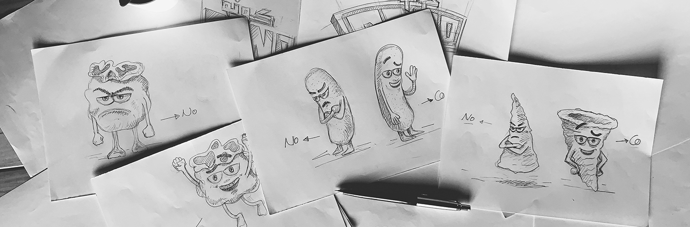
CHARACTER design
Cono is a different kind of snack. And that's what the entire communication is based on. And that's why we have two lovable characters on each of our products... the optimistic Co and the pessimistic No. As you can see, their characteristics are clearly highlighted with their mannerisms and facial expressions.


Cono Range

Popcorn range


puffs Range

Flavor's Photo Manipulation

Credits
Agency: The Academy
Client: Cono, Egypt Foods
Art Director: Alaa Mansour
Copyrighting: Mohamed Ghazy
3D Characters: Gemini Studio
Account Management: Noura Tag

Appreciate if you like it
Thanks for your time.


